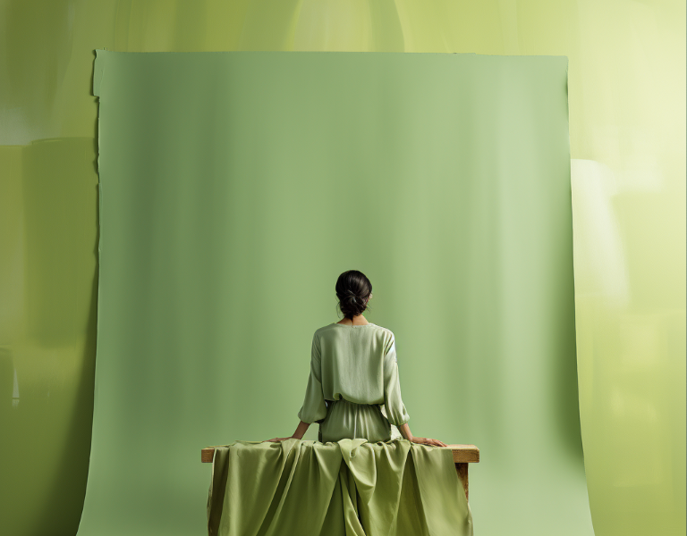
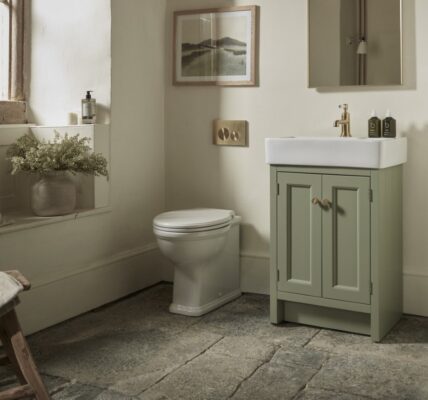
 The Pantone Color of The Year for 2024 is most likely to be a shade of Sage Green – according to up-to-the-minute analysis by AI.
Gender neutrality, warmth, versatility and a link to nature will be key factors in deciding the shade, usually announced at the start of December.
The research was carried out by homes & interiors PR specialists jwc, in conjunction with Google’s AI bot Bard, which uses real-time data to make decisions.
jwc founder John Warburton, said: “The results were mind-boggling.
“We asked Bard to give 100 predictions for the CoTY 2024, along with the reasons for choosing.
“We collated the data and green shades were in the majority by quite a margin
“These were closely followed by shades of blue, browns, pinks and orange, with red and yellow appearing the least favourites.”
All the chosen colours embodied the benefits which the AI see as key to Pantone’s decision. These ket elements are:
- Natural colors: Many of the guesses were natural colors, such as sage green, teal blue, cobalt blue, indigo blue, emerald green, olive green, mauve pink, fuchsia pink, magenta pink, violet pink, lilac pink, burgundy red, maroon red, and terracotta brown. Suggesting a growing interest in nature and sustainability.
- Warm colors: Many of the guesses are warm colors, such as rooibos tea, desert flower, apricot, persimmon, coral, marigold, copper, and brass. This suggests a desire for warmth and comfort.
- Gender-neutral colors: All of the guesses are gender-neutral colors. This suggests a growing trend towards inclusivity and diversity.
- Versatile colors: All of the guesses are versatile colors that can be used in a variety of settings and applications. This suggests a desire for practicality and flexibility.
John added: “We then asked Bard to choose the two shades most likely to be chosen, to which it responded with Sage Green and Cobalt Blue.”
The AI favoured Sage Green, for being a: “calming and restorative colour is associated with nature and the outdoors. It is also a versatile colour that can be used in a variety of settings, from homes and offices to fashion and beauty.”
Cobalt Blue, it said is a: “Bold and eye-catching colour that is both sophisticated and versatile. It is a colour that can be used to make a statement, but it can also be used to create a sense of calm and tranquillity.”
John added: “We decided to use Google Bard, as opposed to ChatGPT, because Bard has access to all current data and works in real time, whereas ChatGPT only has data up to 2022.”
The question we posed 100 times was: ‘Pantone are due to announce their colour of the year for 2024 in December. Using what you understand about colour trends, make a guess at what Pantone Colour of the Year 2024 might be – and explain why.’
Here are the main colours returned from the research, arranged in order of frequency:
| Watercress | green | Unique and vibrant, versatile, positive and energetic, associated with nature and wellness, gender-neutral, global |
| Bistro Green | green | Earthy and sophisticated, versatile, gender-neutral |
| Teal | green | Unique and eye-catching, versatile, gender-neutral |
| Sage green | green | Calming and restorative, associated with nature and the outdoors, versatile, gender-neutral |
| Olive green | green | Earthy and sophisticated, versatile and flattering, gender-neutral |
| Emerald green | green | Luxurious and elegant, associated with nature and the outdoors, gender-neutral |
| Forest Green | green | A nod to deep woods, exploration, associated with nature and the outdoors, versatile, gender-neutral |
| Horizon Blue | blue | Atmospheric and calming, reminiscent of the sea and the sky, versatile, gender-neutral |
| Navy | blue | Classic and timeless, versatile and flattering, gender-neutral |
| Cobalt | blue | Bold and eye-catching, sophisticated and versatile, gender-neutral |
| Indigo | blue | Deep and mysterious, sophisticated and versatile, gender-neutral |
| Apricot | orange | Vibrant and cheerful, associated with nature and the outdoors, gender-neutral |
| Coral | orange | Vibrant and playful, associated with nature and the outdoors, gender-neutral |
| Persimmon | orange | Warm and inviting, vibrant and cheerful, associated with nature and the outdoors, versatile, gender-neutral |
| Marigold | orange | Warm and inviting, vibrant and cheerful, associated with nature and the outdoors, gender-neutral |
| Clay | brown | Earthy and grounded, versatile, gender-neutral |
| Terracotta | brown | Earthy and grounded, sophisticated and versatile, gender-neutral |
| Chutney Brown | brown | Warm and inviting, versatile, gender-neutral |
| Desert Flower | pink | Unique and eye-catching, versatile, positive and uplifting, associated with nature and the outdoors, gender-neutral, global |
| Blush | pink | Soft and feminine, versatile and flattering, gender-neutral |
| Charcoal | grey | Sophisticated and versatile, gender-neutral |
| Lavender | purple | Soft and soothing, versatile, gender-neutral |
| Rooibos Tea | Red | Warm and inviting, versatile, positive, associated with wellness and self-care, gender-neutral, global |
| Mustard | yellow | Warm and inviting, versatile, gender-neutral |
Percentage of shade frequency:
| green | 29.17% |
| blue | 16.67% |
| brown | 12.50% |
| orange | 16.67% |
| grey | 4.17% |
| pink | 8.33% |
| purple | 4.17% |
| red | 4.17% |
| yellow | 4.17% |
