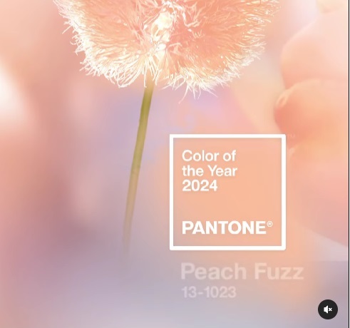

Pantone have revealed thair colour of the year for 2024 and it is Peach Fuzz
According to the colour institute it is a: “Velvety gentle peach whose all-embracing spirit enriches mind, body, and heart.
“A warm and cozy shade highlighting our desire for togetherness with others and the feelings this creates, PANTONE 13-1023 Peach Fuzz presents a fresh approach to a new softness. Subtly sensual, PANTONE 13-1023 Peach Fuzz is a heartfelt peach hue bringing a feeling of tenderness and communicating a message of caring and sharing, community and collaboration.
“Highly suggestive of good taste, PANTONE 13-1023 Peach Fuzz is a gift to the senses, creating a symbiotic relationship between our sense of taste, sight, touch, and scent.”
Last year’s choice Viva Magenta (Pantone 18-1750) was inspired by the red of cochineal crimson. The hue was said to be brave and fearless, depicting optimism and joy as well as resilience, outside-the-box thinking to create a better world.
Since its inception in 1999, Pantone’s Color of the Year has become a highly anticipated event, influencing industries ranging from fashion and design to marketing and consumer trends. Each chosen color is carefully selected by the Pantone Color Institute, reflecting the prevailing mood and aspirations of the year ahead.
In 2000, Cerulean Blue, a vibrant yet calming shade, was chosen as the first Pantone Color of the Year, symbolizing hope and optimism for the new millennium. Subsequent years saw a diverse range of colors emerge, each reflecting the unique zeitgeist of its time.
2001 brought forth Vivid Pink, a bold and energizing hue that embodied the spirit of confidence and celebration. In 2002, the focus shifted to Easy Green, a soothing and refreshing shade that represented harmony and environmental consciousness.
The following years saw a continued exploration of color symbolism, with shades like Mystic Red (2003), Aura Gold (2004), Turquoise Blue (2010), Tangerine Tango (2012), and Emerald (2013) each capturing the essence of their respective eras.
In 2014, Radiant Orchid emerged as a symbol of imaginative thinking and non-conformity. Serenity, a tranquil blue-green hue, found its way into homes and design in 2016, representing peace and tranquility amidst a world of change.
Ultra Violet, a bold and enigmatic shade, was chosen as the Color of the Year in 2018, reflecting the growing interest in spirituality, individuality, and innovation.
2019 saw the introduction of Living Coral, a warm and vibrant hue that celebrated the natural world and the desire for connection. Reflecting the challenges of the pandemic, Classic Blue and Illuminating were selected as the dual Color of the Year for 2021, symbolizing resilience and hope.
And in 2022, Pantone unveiled Very Peri, a hybrid of purple and blue, representing the merging of our physical and digital worlds, creativity, and human imagination.
As Pantone continues its tradition of selecting the Color of the Year, it remains a powerful tool for shaping trends, igniting conversations, and reflecting the ever-evolving tapestry of human experience.